|
Alicia Castillo
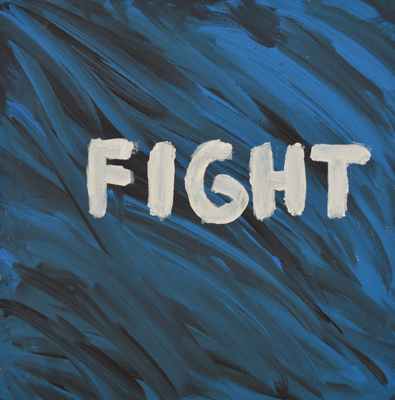
The choice 2022 Acrylic paint and canvas 16” x 20” The first artwork was about fighting for how you want to feel. My inspiration for this was for the people dealing with problems. It was suposed to show that you do have a choice and you can change your life and your options, and all you have to do is fight for it. Fight for happiness or calmness if it’s what you want. The two emotions are represented by the separate colors. Blue was the color representing calmness. On the other hand, black was repersenting stress and troubles that a lot of people go through. In] this artwork, it was to be seen more as jumbled and mixed together than smooth or calming the reason being that it was supposed to be seen as the colors of emotions fighting for power. To make it more apparent that they were fighting the word fight was placed smack down in the middle so the audience can see the main point was to fight. The feeling for the artwork is more of a thinking feel to it because there are choices and it’s saying a choice has to be made |
|
Alicia Castillo
Just for a moment 2022 Paper and markers 8.5w 11h This project was to make other people see that it’s good to have goals and achievements. Originally it was going to be a whole poster and sticky notes but honestly, I changed my mind. I changed my idea because personally, I’ve walked by so many things, and I've never even given a second thought about them. I’ve never looked at something and been like oh yea I want to write on that or add something. I would much rather read a quote and be like yeah that's so true and have that quote with me maybe even take a picture but that's me. The inspiration was definitely from seeing other artists put words in random places and people look and take pictures. I think it’s cool because for at least a moment they read something that can make their day and in my opinion, that's all that really matters in the end. |
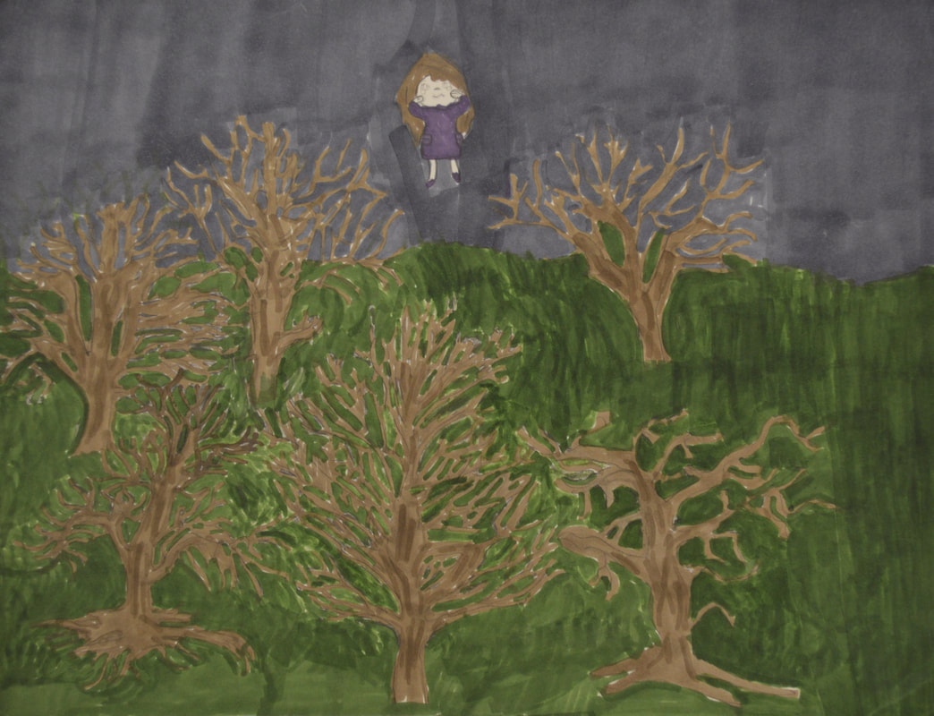
Alicia Castillo
The woods 2022 Paper and markers 8” x 11” My second project was about a girl going into the woods and feeling scared and small. The inspiration for it was definitely from personal experience. When I was little I was always very scared of dark places and with trees, WOO OH forget it I would be absolutely terrified. To give it a scary feeling I made the trees dead without any leaves and stuck to a dark color palette so there were no bright colors at all. Whereas if it would have been bright it would’ve given a whole different vibe. The whole point of the project was to tell a story and mine told the story of a little girl walking through the woods scared. This comes back to why the sky was more of a deeper gray than blue. Instead of being a bright blue is was dark to give it a darker scene. |
